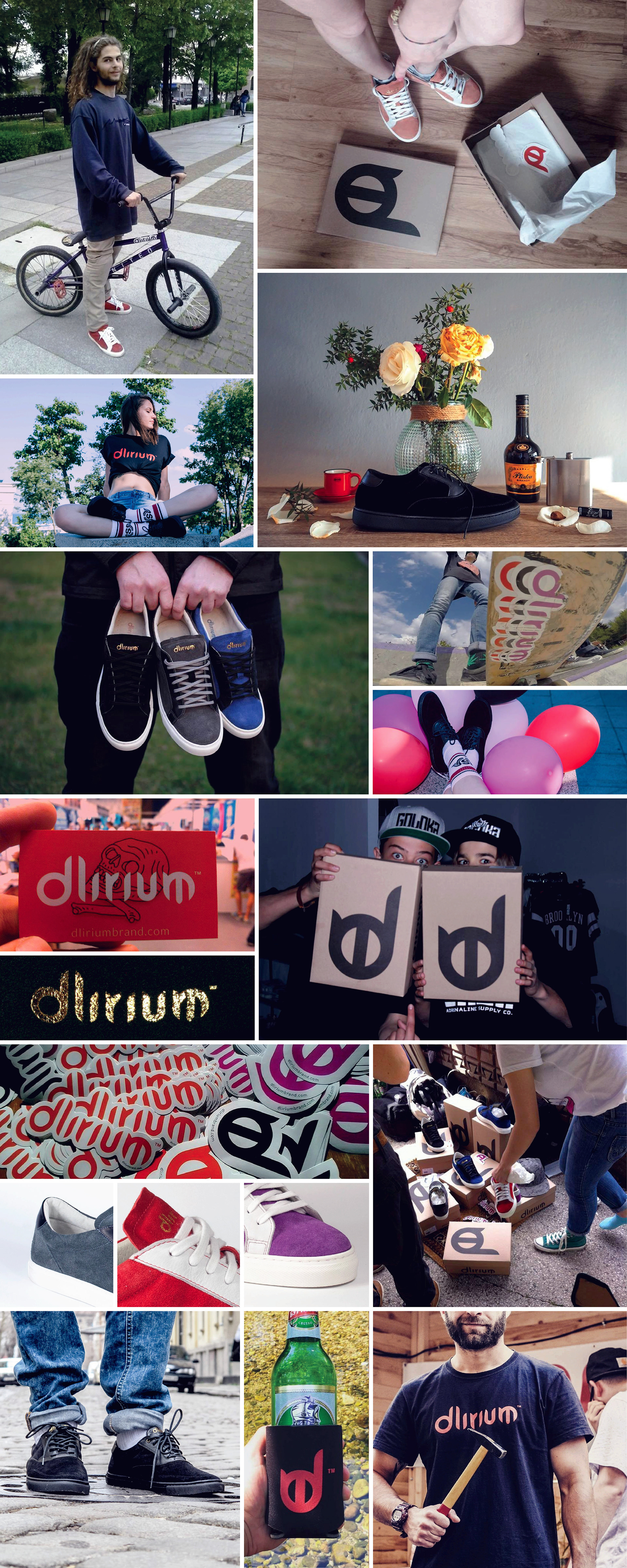

In 2015 I was invited to design a logotype for a new brand of sneakers, Dlirium.
The brand was created by a group of friends passioned about sneakers and eager to create their owns.
Their will to create sneakers was so pure that in the first stage they didn't want to have a logo, the sneaker should do it. But I was contacted, just in case. After some e-mails and a first meeting their mind changed and they were glad to asked me to design their logo.
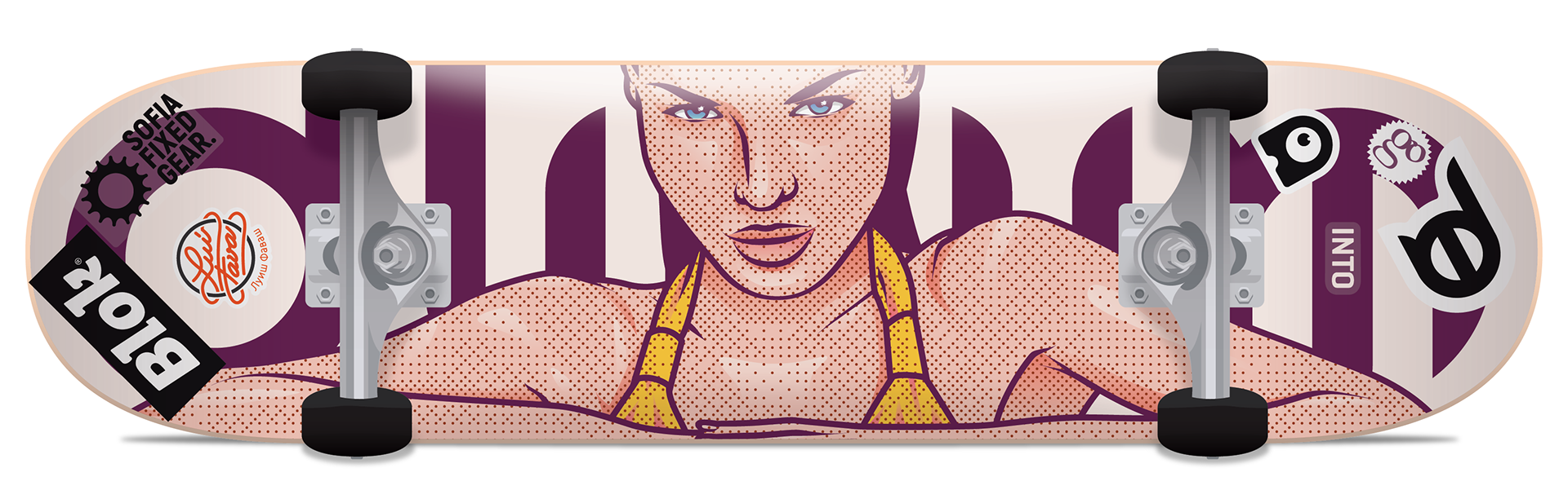
Above there is a skateboard with some stickers related with Sofia (Bulgaria) and my time in that city.
Sofia Fixed Gear – is a group created for people that ride fixed gear in Sofia and was because of it that I knew Emo and was invited to do the logo.
Block Shop – A street wear brand & shop where besides other things Dlirium shoes are for sail.
Luís Favas – That was my sticker that I was using in those years.
INTO Branding – The branding agency were I was working when I did this and where I learn all the branding tricks that I know.
Animento – (the cute A with an eye) The last studio I worked in Sofia and that stepped up my illustrations skills.
Go Guide – A friendly city guide that I collaborated for two times and that was part of the city landscape.
Dlirium – (the devil as it was nicknamed) it's the jam!
Bellow there are some answers for the question done to me to be part of the Dlirium blog.
Hi Luís, first a big thanks you for doing the mega cool logo for Dlirium. The custom type and all is just pure awesomeness. Can you let our readers know a little bit about you, how did you started your design career and maybe what brought you over here in Sofia?
Hi, you are welcome! It was great to be invited for this project and work with people so passionate with the brand that they want to create.
I did my first work as a freelancer in 2006 and since then I haven’t stopped. I have been doing illustrations, lettering, graphic design, logos, videos, big size paints and also self-promotional work, exhibitions and talks.
In 2010 I worked as an intern in the newspaper “i”, doing graphic design and illustrations. In the same year the newspaper got the award for “World’s best design Newspaper” by SND – Society for News Design. After that I worked for an Illustration agency for one year.
After I got my Master Degree in 2013, I applied to a worldwide internship program created by the Portuguese government. This internship is a once in a lifetime opportunity and we don’t get to choose the country or company for which we will work. So some people go to New York, Xangai, Kabul, London . . . and Sofia for me.
In January 2014 I started the internship for 6 months, then I was invited to stay and here I am. Since I arrived, I started as an intern in Carré Noir, move to Junior Art Director in Publicis Consultants and now I’m working as a Designer in INTO Branding.
(2020 update: Then I moved to StoryMe as Illustrator and then moved as Art Director do Animento before move back to Portugal).
When you start a new project what are the first steps you take?
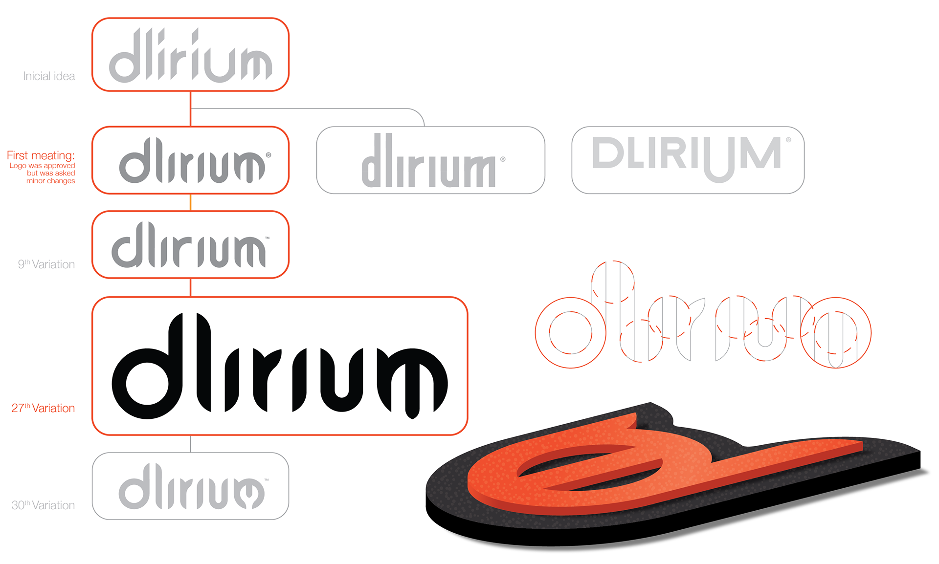
I start by sketching some ideas, In this case I wanted to design all the letters of the logo so I went for different approaches. Calligraphy, tag, serif and san serif. Going very complex to then clean it to it’s core.Meanwhile I search for inspiration and study other brands, looking for what works or not.
When we saw the three identity propositions you made, it was a love at first sight with the one siting proudly on the sneakers now. Can you tell our readers more about how you approached and developed the logo?
The three versions were made following the core idea of the brand but with different points of view. One more serious, very serious, easy to ready and very contained. Other, the chosen one, cool as hell, fresh, and again cool as hell (I hope I didn’t forgot to say that is cool as hell but when we meet, I wasn’t sure if the others will approve it).
Is there anything you would do differently now? :)
Actually no. Yesterday I was reading (yeah right, just looking to the pictures because I still can’t read Bulgarian) an interview in a Bulgarian website and I was thinking: “F*** yeah! This logo is amazing”.
Probably some of the details of the logo could change during the years due technical problems, otherwise it is great like it is.
Probably the only thing I would change is slightly reduce the spacing between the “r” and the “i”.
And to wrap it up, can you point to some cool design blogs you follow daily?
I will disappoint you, nowadays I don’t follow any blog or website daily.
I just do my daily likes dropping in Instagram where I follow some design studios, illustrators, designers and brands.
I also do my daily Vimeo visualisation on lunch time of videos related to fixed gear, design, video or just random things.
Back in the days I was daily following Foooound, the blog from the brand Rebel Eight and Woostercollective.
"Dlirium sneakers have the philosophy of Made Here, Not There, getting inspired by our local environment we try to transfer it in a unique local product. When you hear Dlirium, think of that quality moment with your best friends having fun! We made the brand to represent and extend that moment. To make sure that everyone can feel the passion we have for the sneakers, we observe the manufacturing process ourselves, taking great care of the smallest details and the quality of used materials. From the rubber soles to the high quality suede to the leather lining, we make sure that all materials are carefully selected to match the hand made craftsmanship we put into practise to bring all pieces together in Dlirium sneakers."