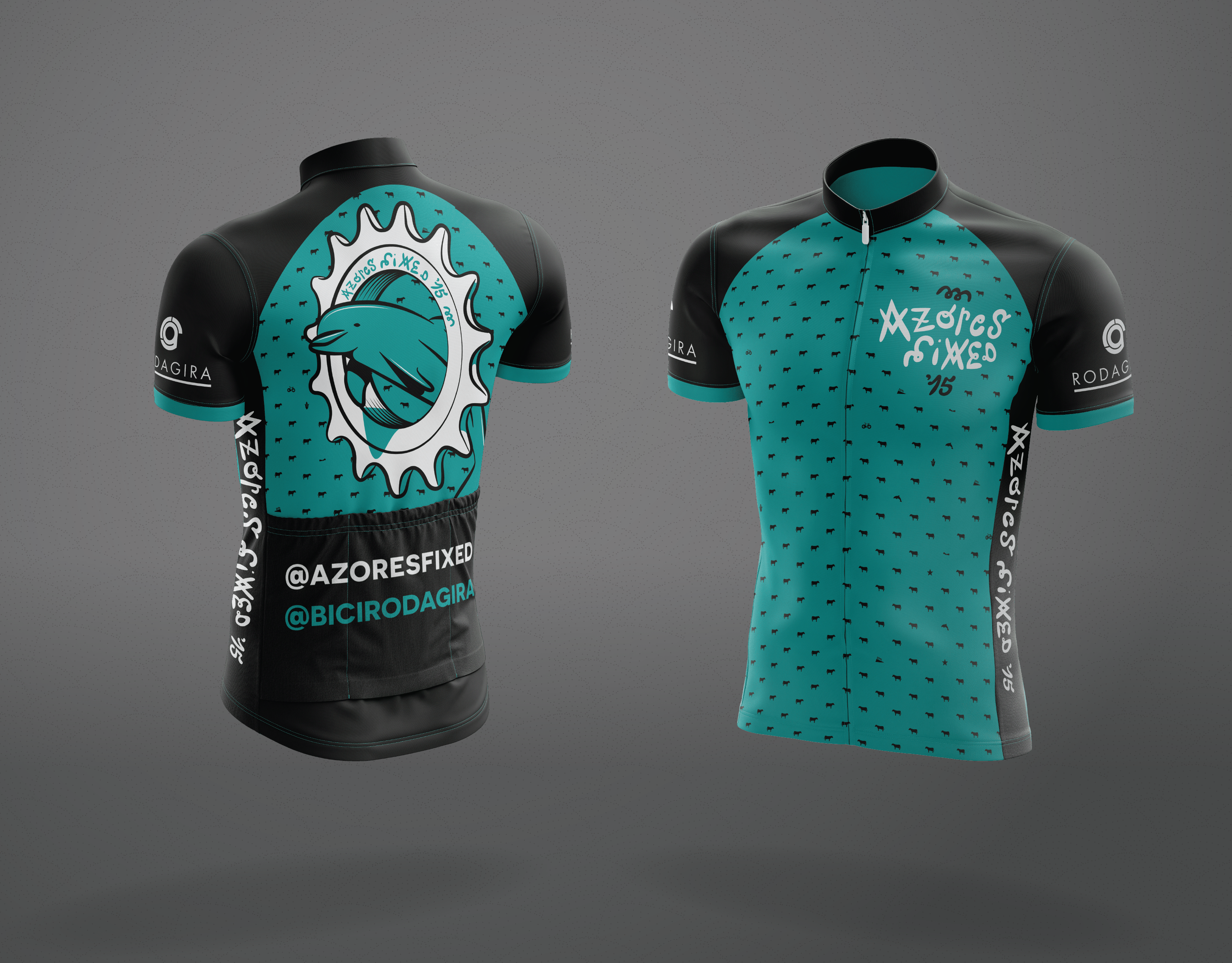

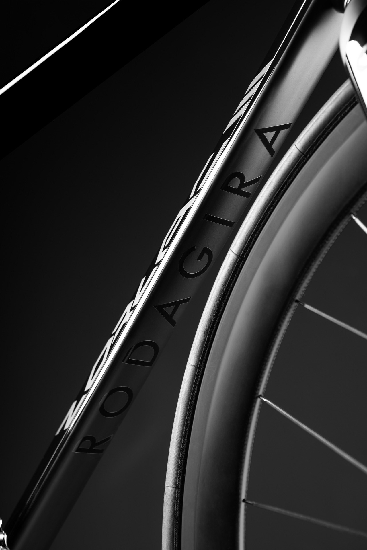
“RodaGira started in 2012 as a bike shop exclusively dedicated to build custom singlespeed and fixedgear track bikes. Soon after that we started designing and producing our own frames. Due to the quality of European craftsmanship and design, our frame models Zorlac and Arrogante became very popular in the fixed gear community, quickly invading the streets all over the world.
“Zorlac was the name of one of the most inspiring companies skate ’80s, creating a huge cult around it. Our idea was to take that name and honor it in cycling what most characterised the brand, aggressiveness!
It is manufactured in Europe in 7005 and 7020 aluminum Oria, available in limited production.”
It is manufactured in Europe in 7005 and 7020 aluminum Oria, available in limited production.”
DISCLAIMER:
I only designed the logo for the Zorlac 3.
For the sake of the presentation, I think that it is important to show the story of this bicycle’s frame.
I only designed the logo for the Zorlac 3.
For the sake of the presentation, I think that it is important to show the story of this bicycle’s frame.

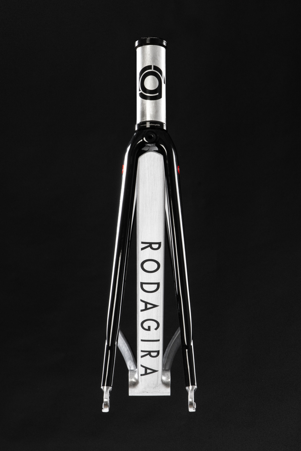
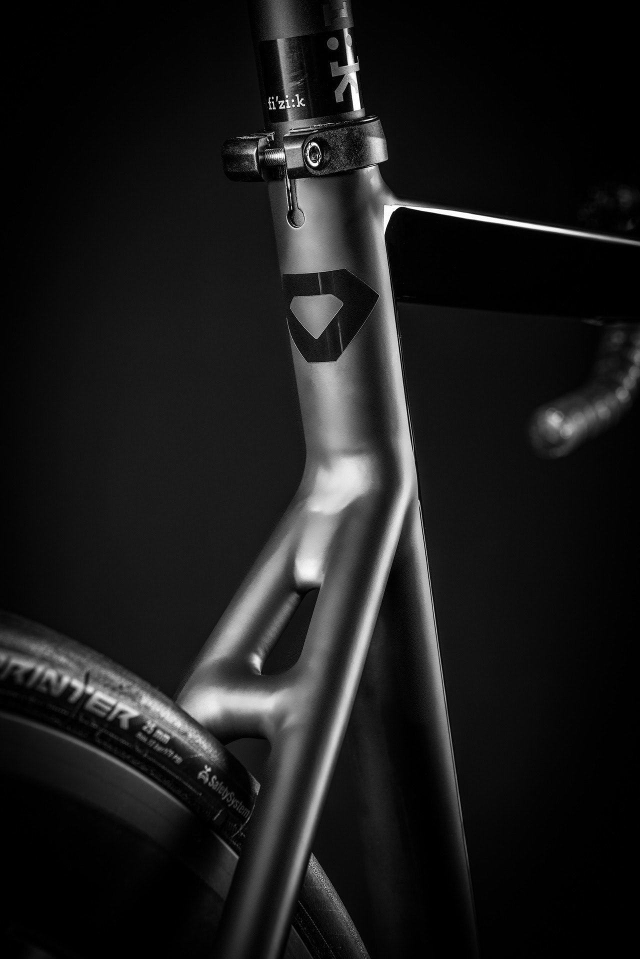
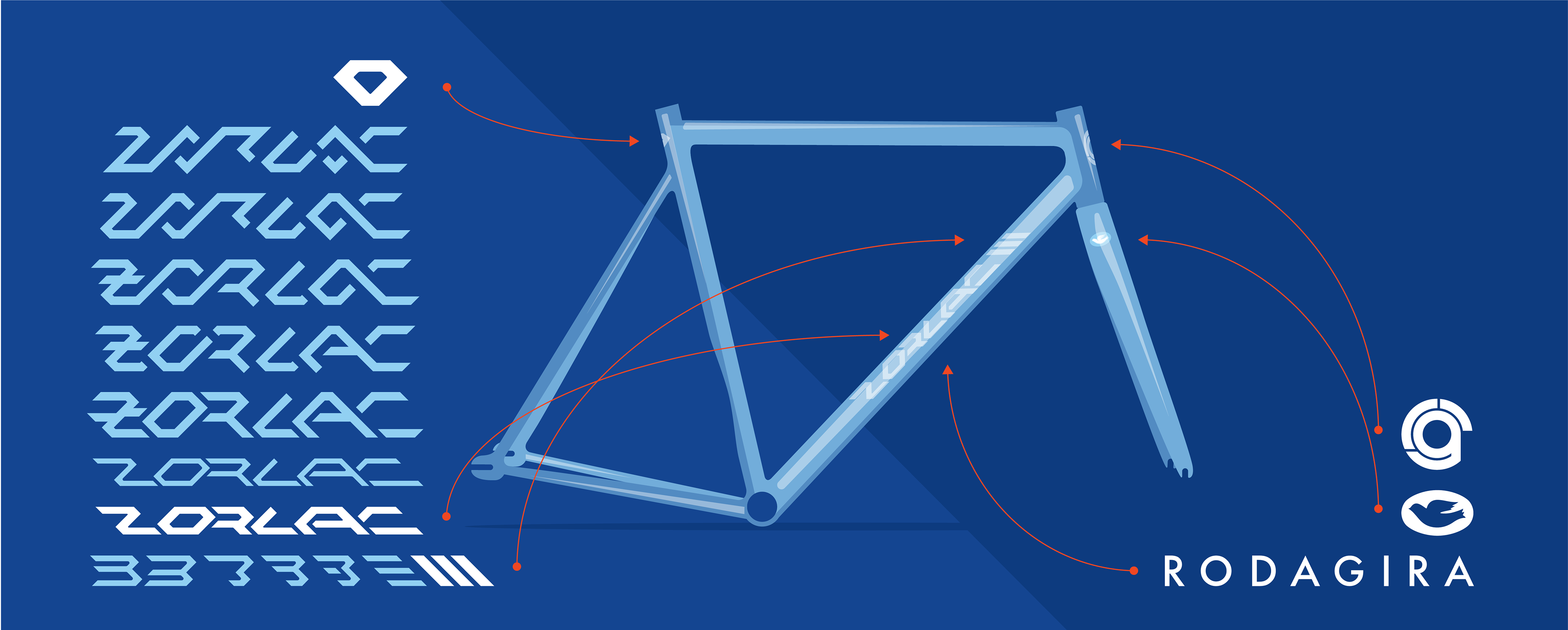
ZORLAC 1
This very charismatic triangular tubing gave the inspiration for the geometric construction of this frame’s logo.
The logo was designed by Miguel Rellego. Creating a path for the following designers.
Above you can see the absolute first Zorlac frame, well it’s even before the first, it’s the prototype idealised by the Rodagira’s owner Nuno Sota.
This pictures were taken by the photographer Luís Pires who by the way owns this bicycle.

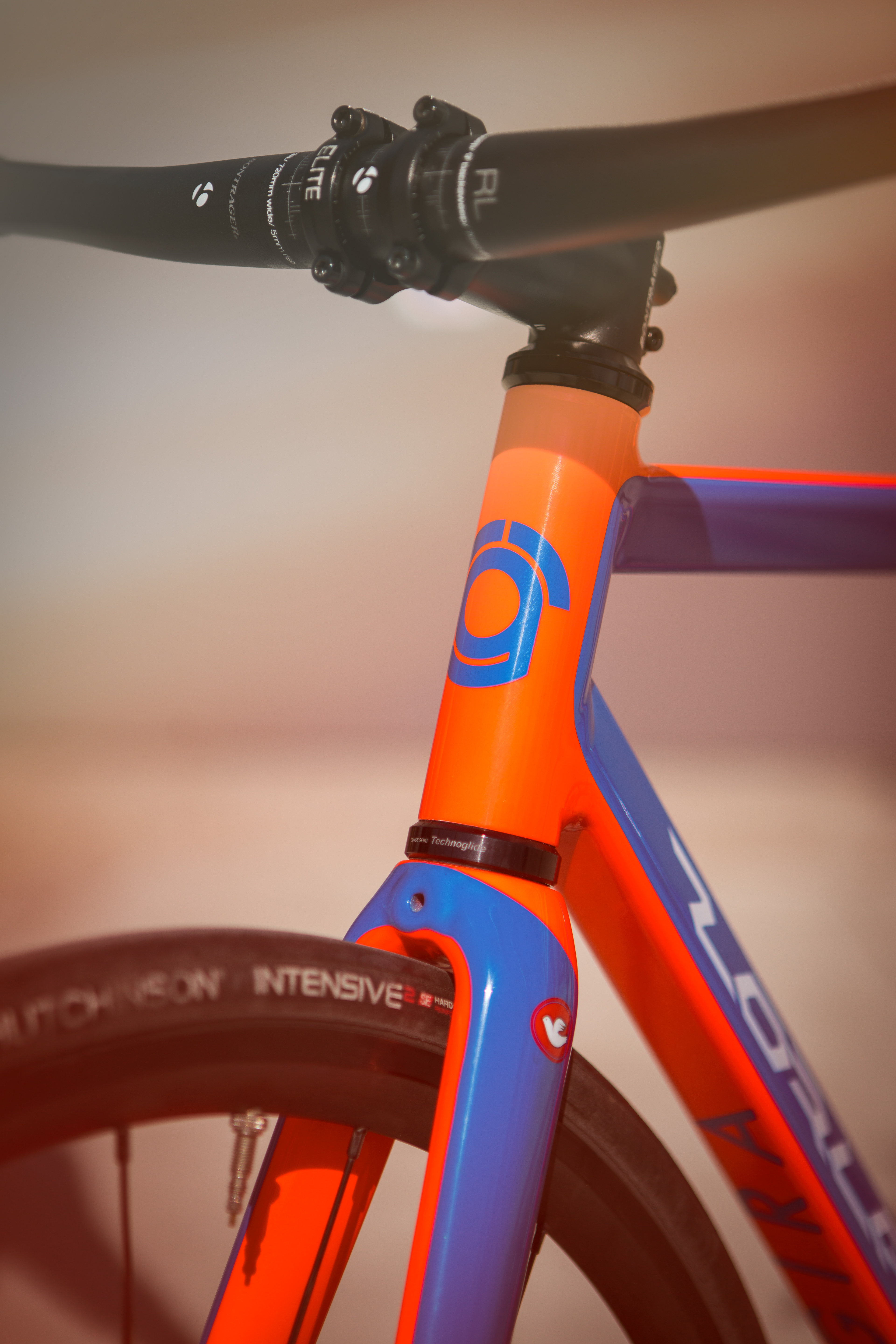
ZORLAC 2
The design of the second logo was Manuel Lino’s work.
This new triangular-shaped-frame-tubing model gave Lino the inspiration for a more geometric composition. The amount of details were reduced in order to enhance the tube’s geometry.
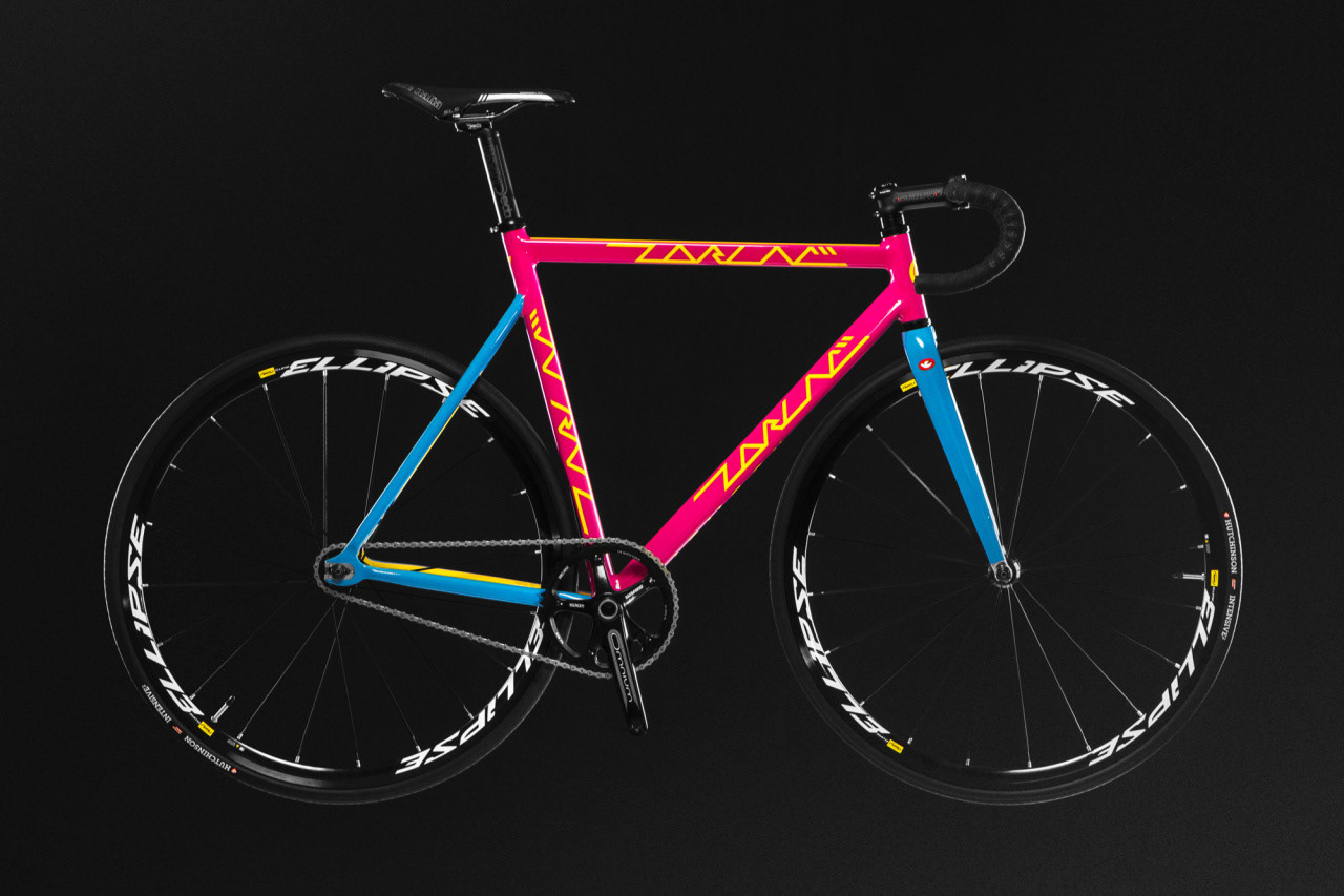
Zorlac 2 came with a slightly new geometry, new dropouts and seat stays. The color scheme is completely customisable, with more than a thousand combinations between stays, main tubes, fork, graphics and interior sides – all up to the buyer.
The pictures above were taken by Lino, who besides other things, is the main RodaGira’s photographer.
This new triangular-shaped-frame-tubing model gave Lino the inspiration for a more geometric composition. The amount of details were reduced in order to enhance the tube’s geometry.
Zorlac 2 came with a slightly new geometry, new dropouts and seat stays. The color scheme is completely customisable, with more than a thousand combinations between stays, main tubes, fork, graphics and interior sides – all up to the buyer.
The pictures above were taken by Lino, who besides other things, is the main RodaGira’s photographer.

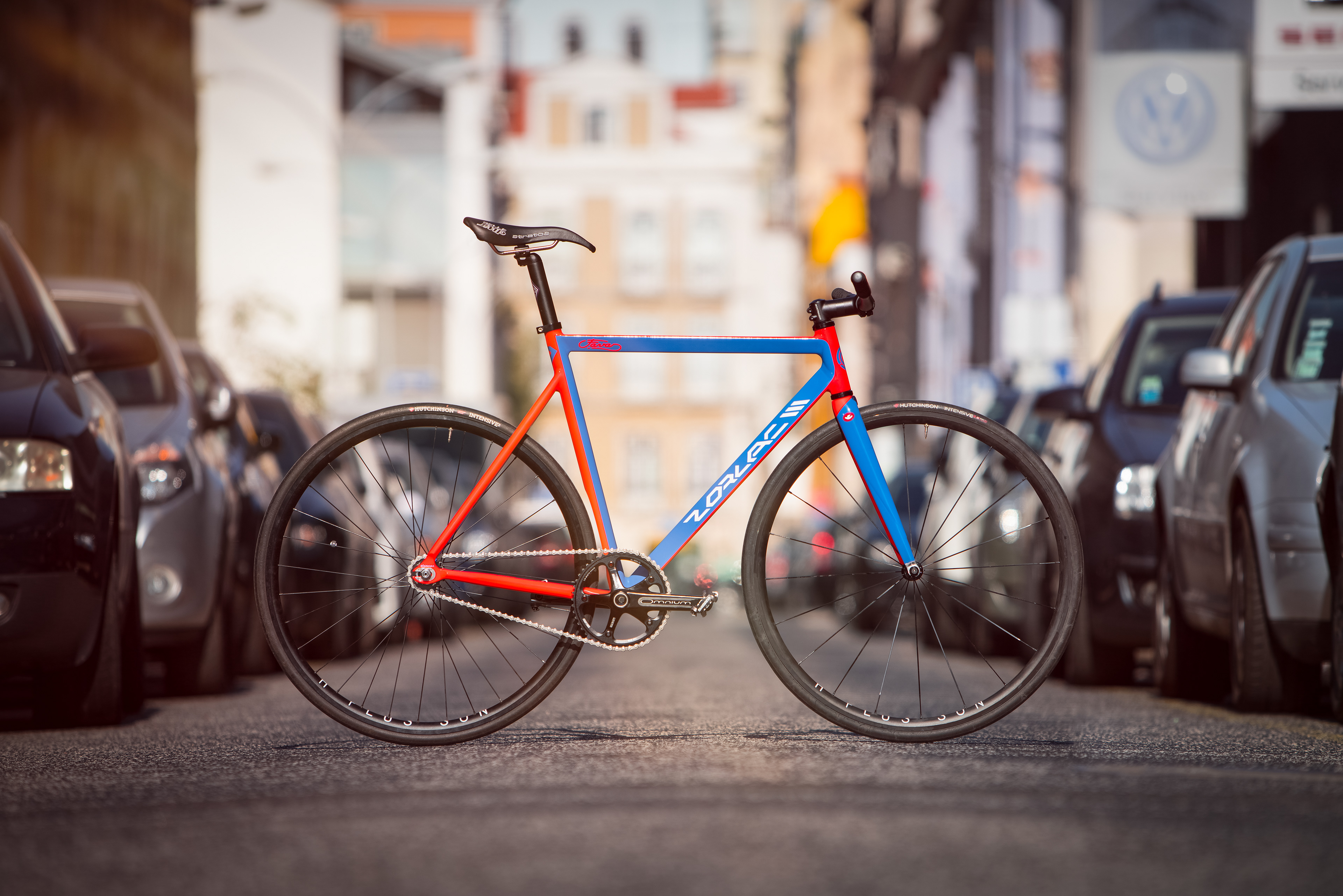
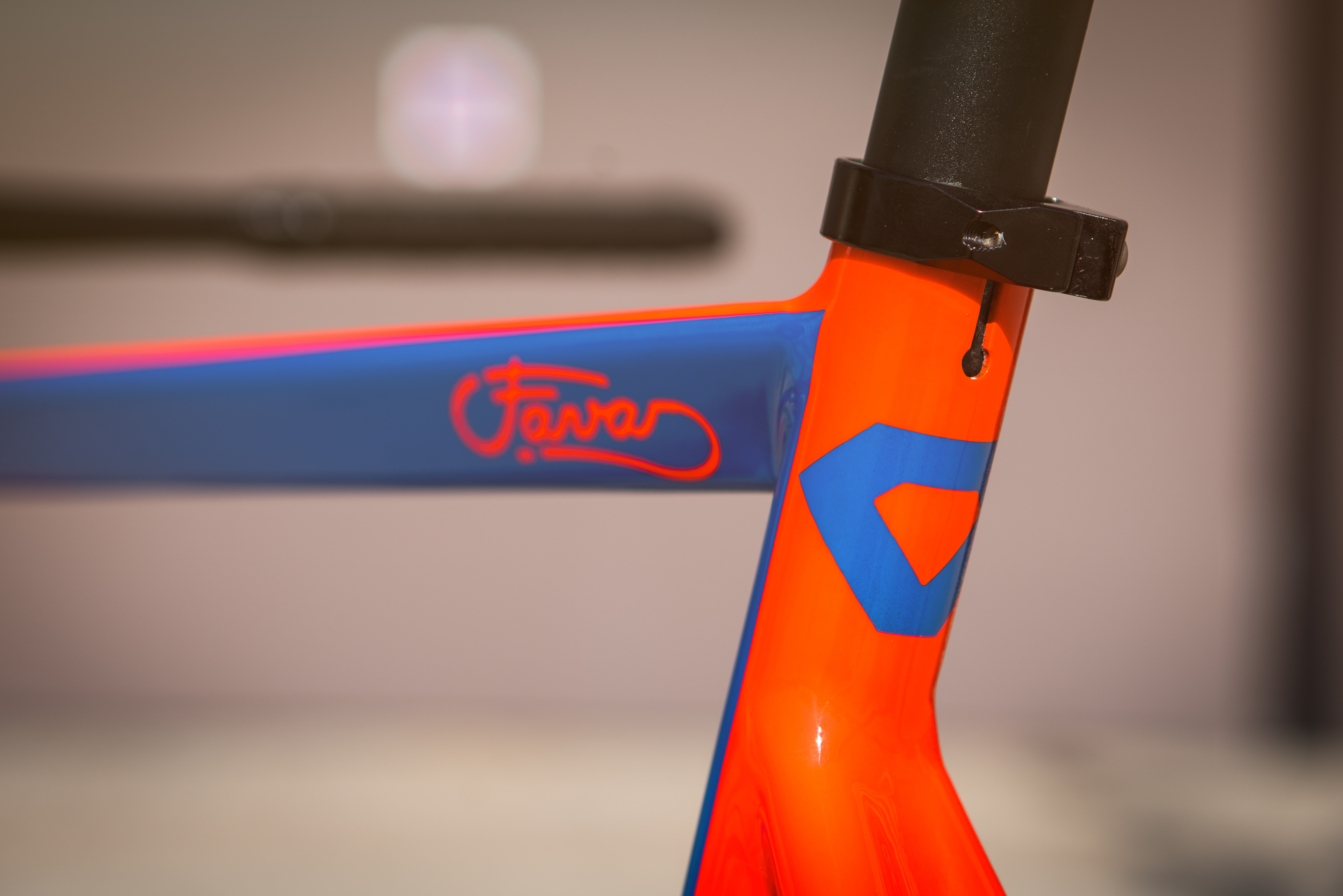
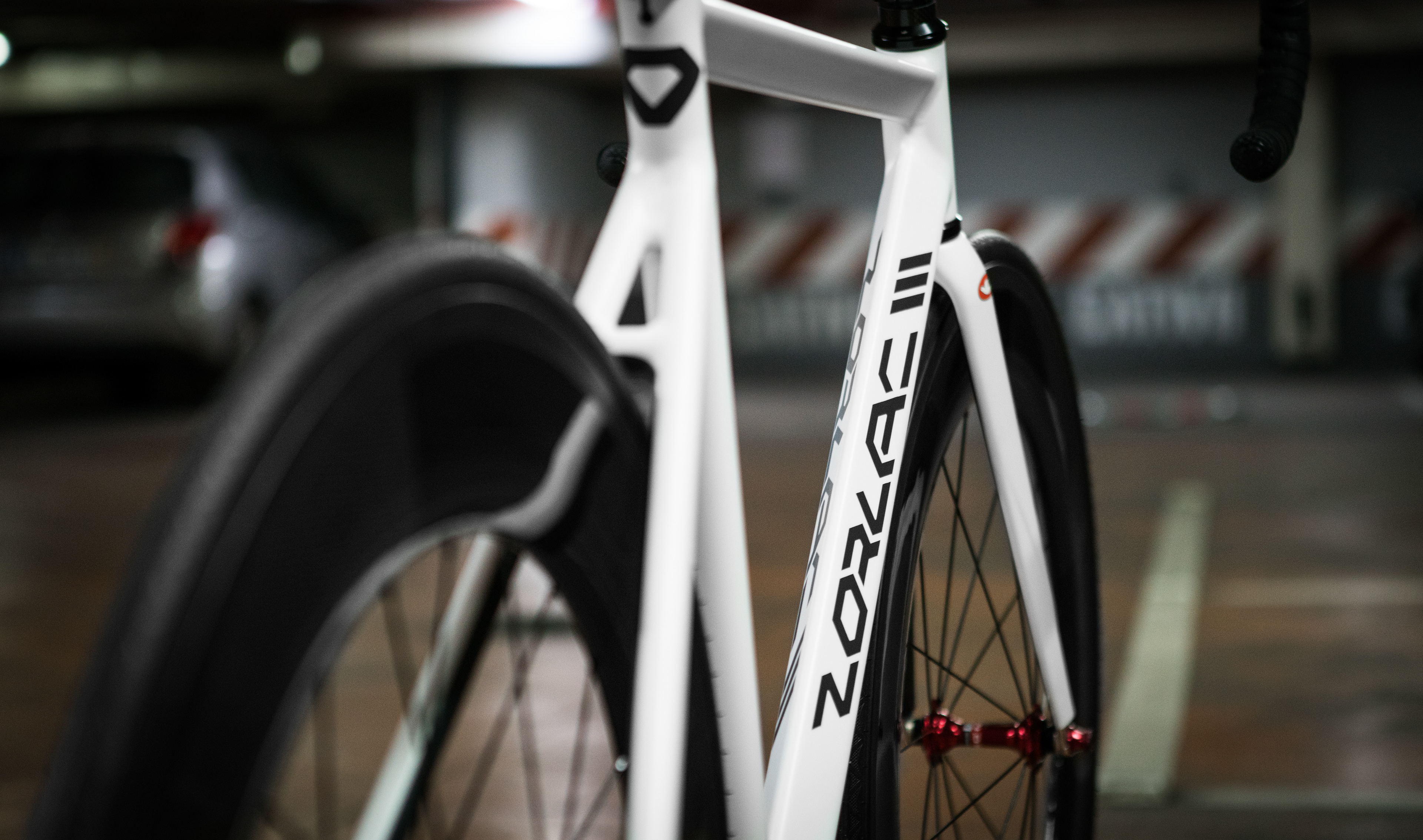
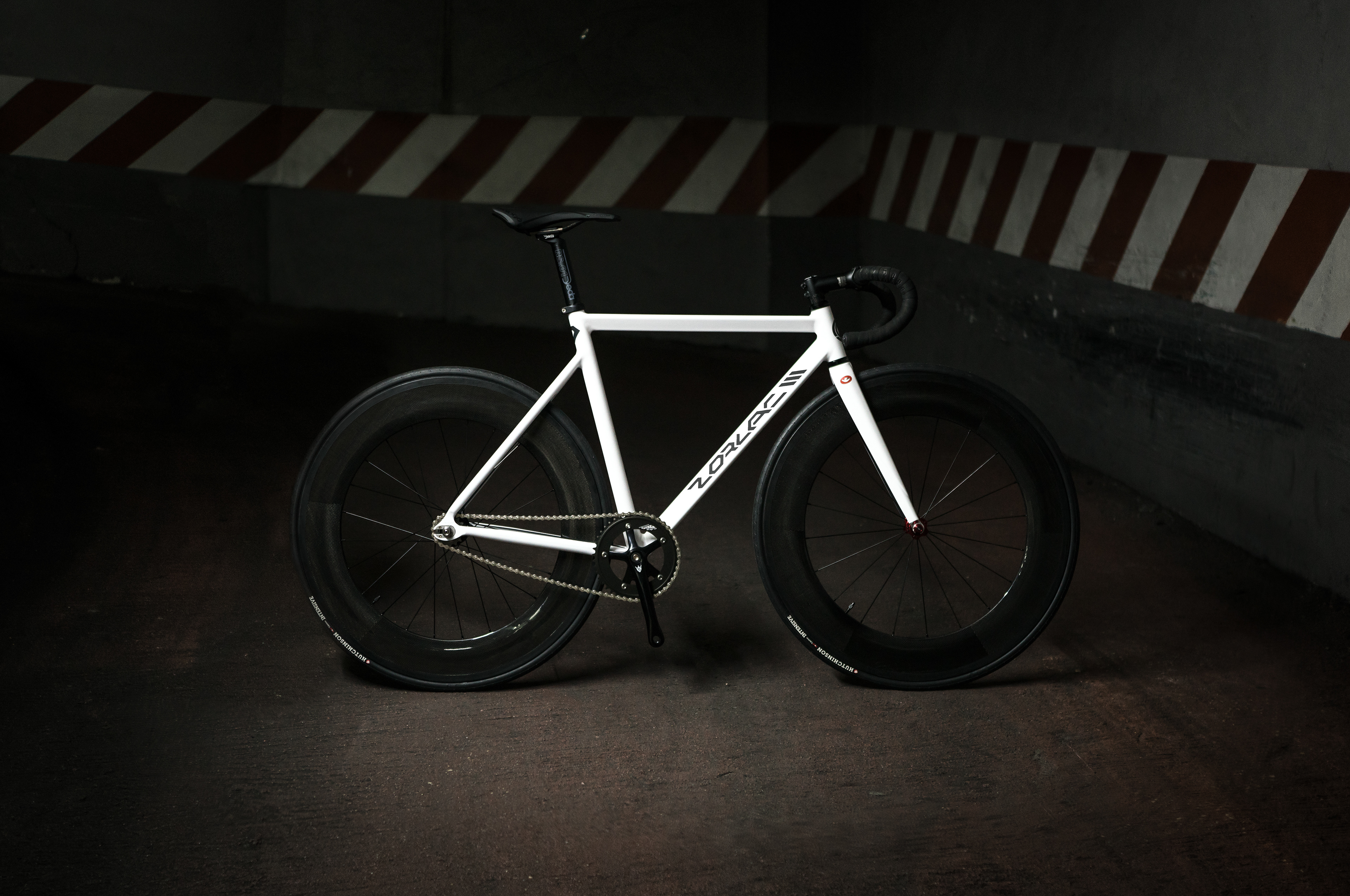
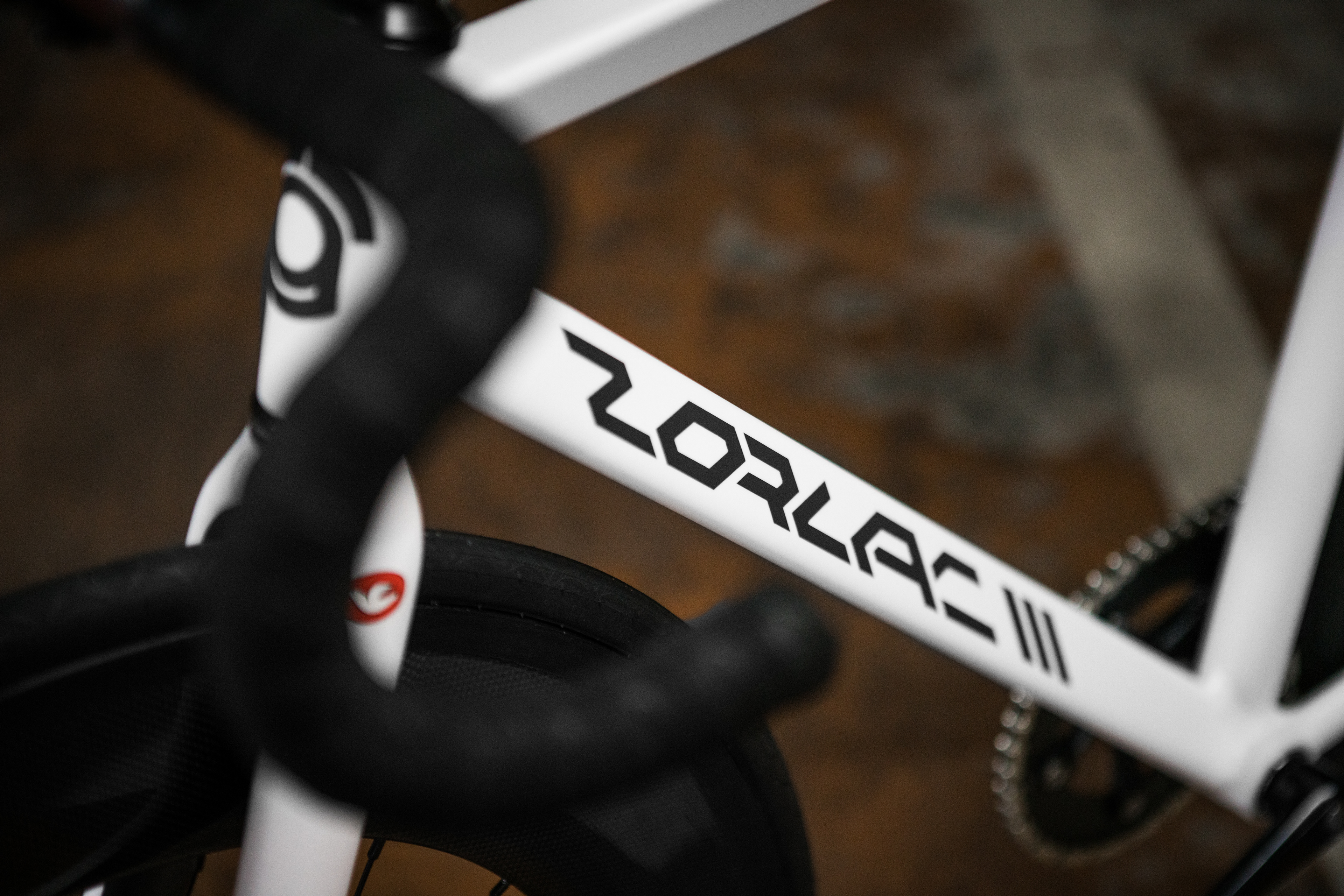
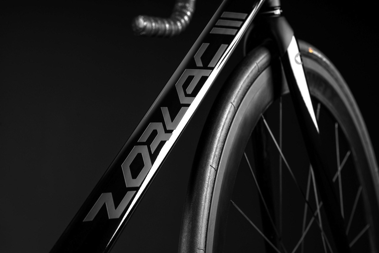
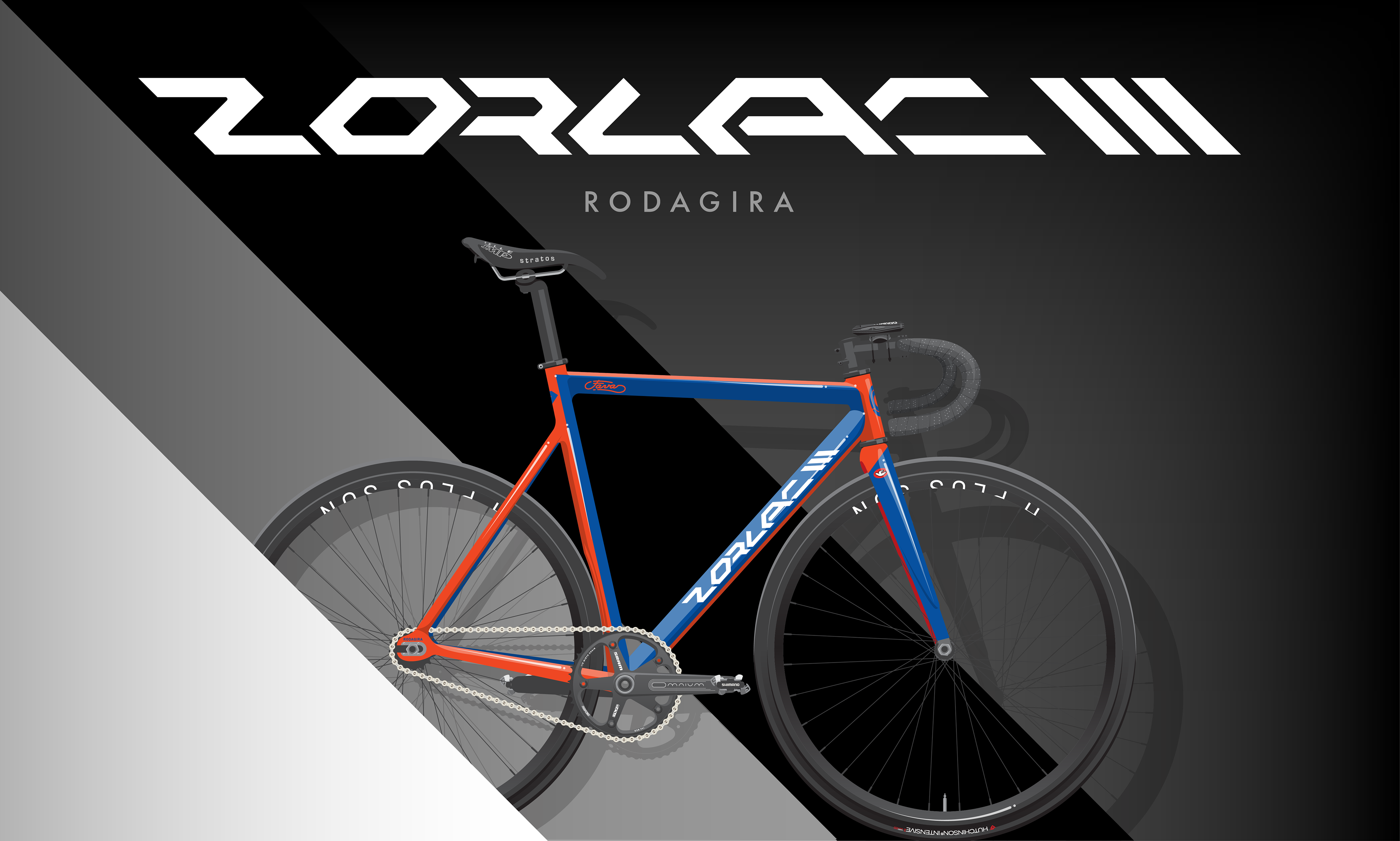
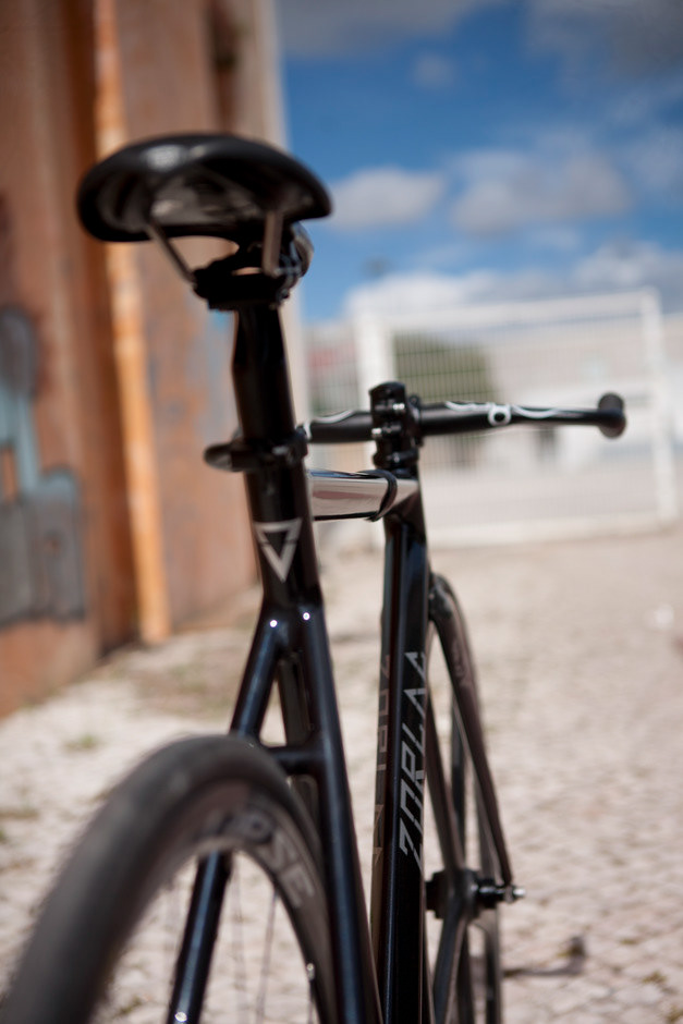
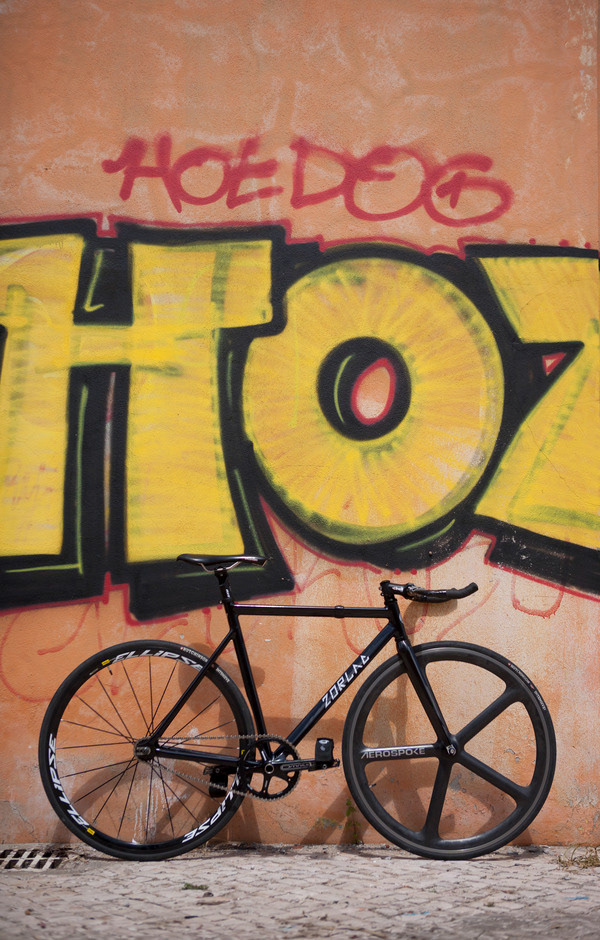
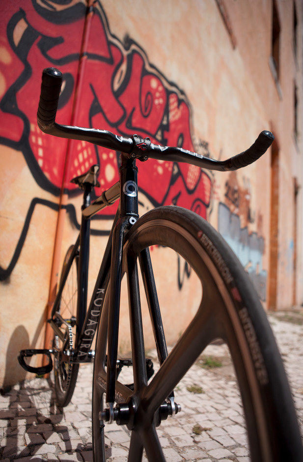
ZORLAC 3
The third was my responsibility.
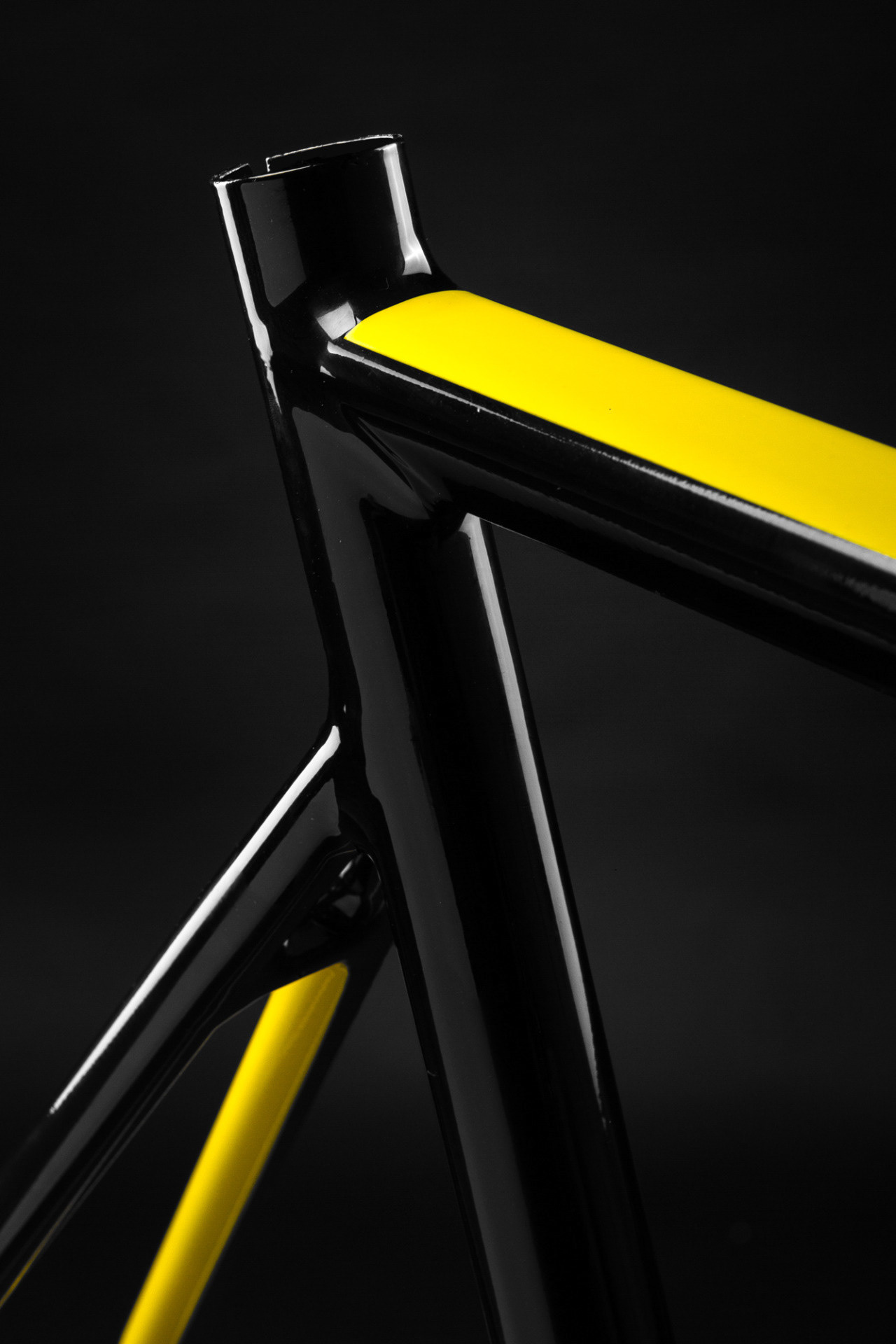
It was difficult to make a newer version of this logo with this triangular and diagonal lines but after lots of variations and calculations the “Eureka” moment arrived!
The big challenge was to create a significant different version of the logo but keeping the ADN.
When I got the angle and thickness right, a balance between the white and black was created.
As extra detail, I added barely visible round corners to match the smooth corners of the frame.
As expected, the photos were taken by Manuel Lino.
Part of the logo’s process
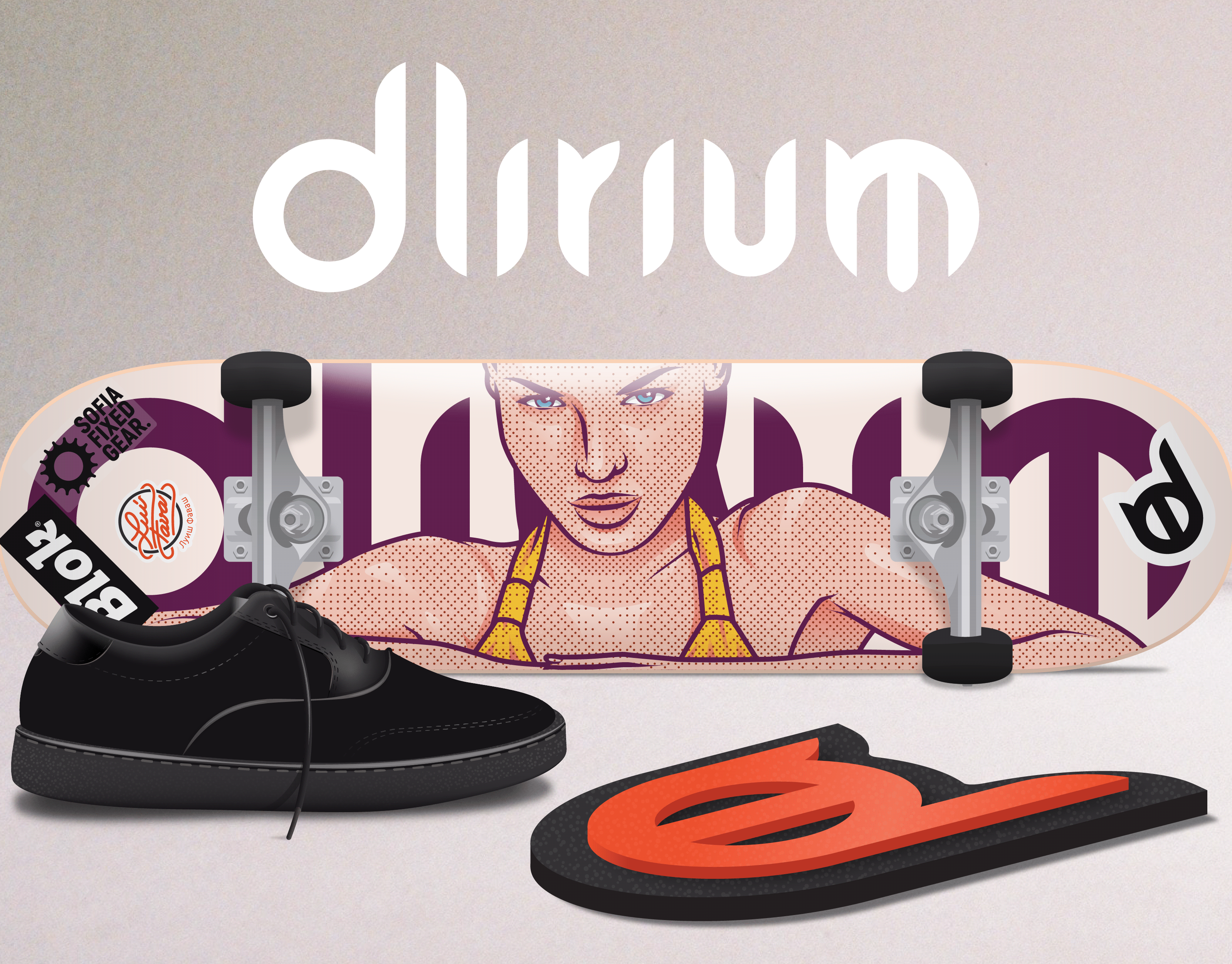
Promotional teaser